From cluttered to clear: redesigning a kids learning platform
A homepage with plenty of content but no clear starting point — rebuilt around flow, not features.
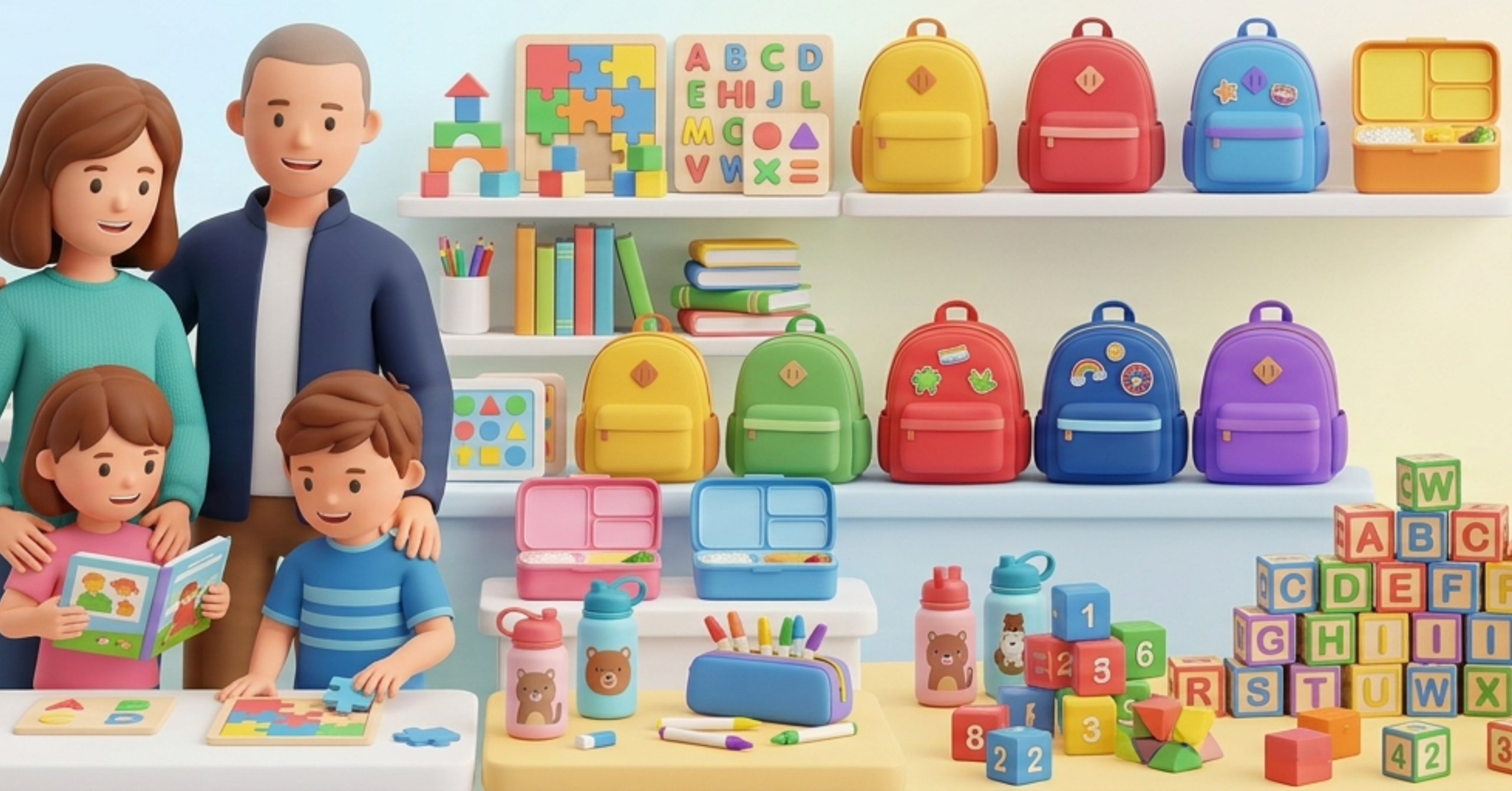
The Problem
At first glance, everything looked fine — there was enough content, decent structure, and a clear intent behind the platform. But once you actually started using it, things felt off. There was no clear starting point. Parents would land on the homepage and just hover around, unsure where to go next. Too many sections were competing for attention, and on mobile it became even more chaotic.
What we did
We stepped back and stopped thinking in terms of features. Instead, we focused on flow. Cleaned up navigation, reduced options on the first screen, and grouped content in a way that felt natural. A lot of time went into spacing, readability, and small interaction fixes — things most people won’t notice consciously but feel instantly. We treated mobile as the primary experience, not an afterthought.
Result
People started staying longer. Instead of bouncing in a few seconds, they began exploring. The platform finally felt usable, which made all the existing content actually matter.
Get in Touch
We’re just a click away. Reach out to our dedicated team for any inquiries, collaborations, or assistance you need. Let’s start a conversation and explore the possibilities together. Your message matters to us. Contact us today.
Phone Number
+1-202-555-0188
hello@digulous.com
Address
37 South Hanover Drive Springfield Gardens, NY 11413
Business Hours
Monday — Friday 9am – 9pm
Saturday — 10am – 3pm
Sunday — Closed